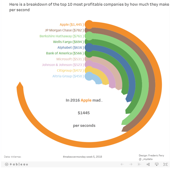
This week Makeover monday the challenge was to visualise data from Titlemax, most profitable companies and how much they make per seconds I decided to learn something new and made a Radial Pie Gauge Chart in Tableau following this excellent tutorial from SuperDataScience. More great tutorials from their sites too. I'm not sure if this type... Continue Reading →
Tableau geometric art experiment
Thanks again to the #makeovermonday community I got inspired by Ken Flerlage work on his 2017 Year of learning post, and more specifically this work on Tableau geometric art. Ken is truly inspirational. I have never seen this done in Tableau before! #Fridayfun, I decided to have a go following the great tutorial from his... Continue Reading →
The world as 100 people
This week for Makeover monday week 48 we were asked to visualise data from 100people.org: The world as 100 people To keep with my Tableau tradition, I decided to learn a new trick. This week I wanted to learn how to make Waffle Charts. I found a great tutorial from Andy's Tableau tip Tuesday ... Continue Reading →
American teens’ favorite social media app
This weeks MakeOver Monday #47 we were asked to visualise data from Business Insider about American teenagers use of social media pp, and specifically which app they prefer The original vis is below What I like: seems easy enough to get the story nice layout can really see the surge for Snapchat What I would... Continue Reading →
Sustainable Cities Mobility Index
For this week Makeover Monday Week 46 we were asked to visualise data from Sustainable Cities Mobility Index (Arcadis report) What I like about this vis: Easy to understand Nice layout What to change: Not sure actually, maybe the green a flags (which aren't city flags) My attempt: As I always try to learn something... Continue Reading →
Life Expectancy at Birth by Country
In this Makeover monday week 45, we were asked to visualise Life Expectancy at Birth by Country data from the World Bank My plan: As I try to learn new Tableau tricks I decided to follow Andy's tutorial to create Small multiple line charts, also adding dynamics labs following this tutorial from the Info Lab... Continue Reading →
Public holidays in the world
This week MakeoverMonday was about to visualise public holidays in the world (data source) This week I have learnt a new Tableau technique: full year calendar heatmap. I was a bit stuck and short of time this week, but took inspiration from Kate Brown's calendar It was quite tricky technically, but with help from the... Continue Reading →
Best jobs for all Myers-Briggs personality type
This week Makeover Monday was about visualing Myers-Briggs personality type Not really inspiring but I still had a go. This week I took the occasion to practice with Tableau Tree Map and tool tips. Live vis link is kindy teacher and nurse Vis: https://goo.gl/c4cCTX
Thanks to the obesity in the USA I learned about Tableau Hex-tile map
Makeover Monday week 41 was about visualising Adult Obesity in the United States. (data) My initial thoughts: It would have been very fun to do this during the live Makeover Monday at #data17 but I don't think I would have time to learn much. So I took this opportunity to learn new Tableau tricks. I... Continue Reading →
An other makeover monday – gun makers shares increase after shooting
After the tragic event on Oct 1 in Las Vegas, I wanted to visualise data from mass shootings in the USA. My first thoughts: I wanted to highlight the fact that gun makers shares increase after each mass shootings Firearms are manufactured in huge numbers Data: I got data from a few different data sources:... Continue Reading →