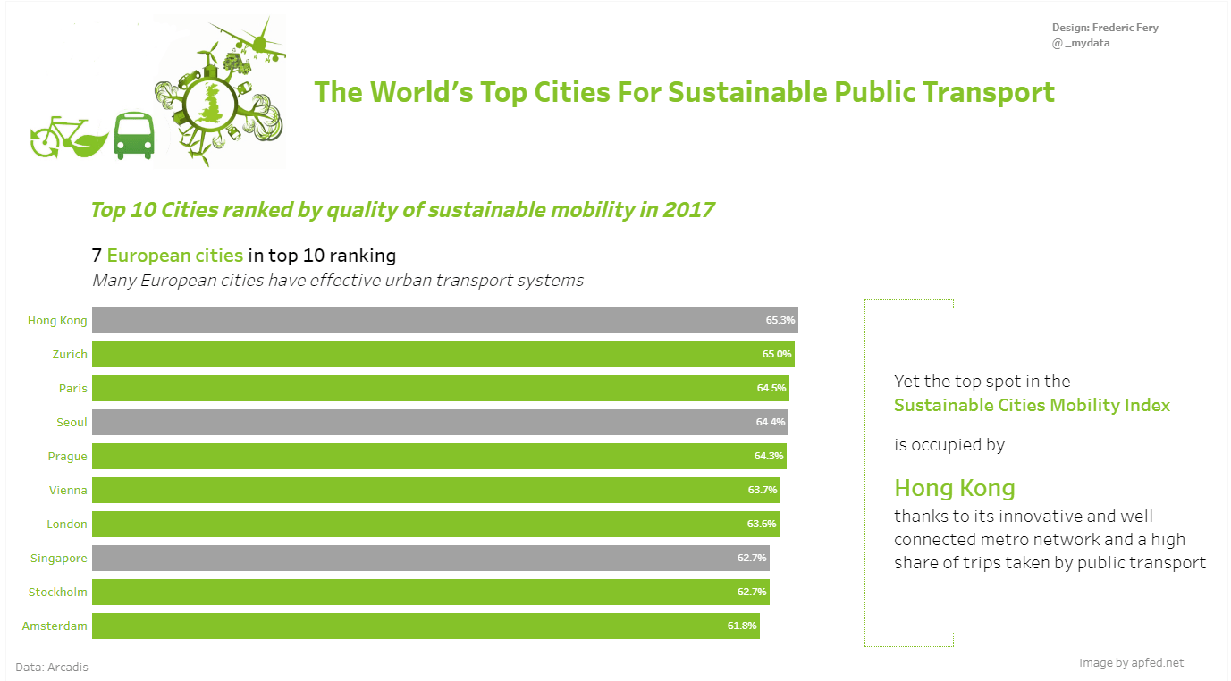
For this week Makeover Monday Week 46 we were asked to visualise data from Sustainable Cities Mobility Index (Arcadis report)
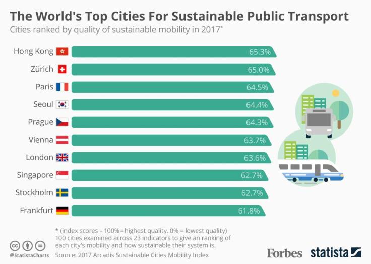
What I like about this vis:
- Easy to understand
- Nice layout
What to change:
- Not sure actually, maybe the green a flags (which aren’t city flags)
My attempt:
As I always try to learn something new, this week I have followed The Information lab tutorial to learn how to add labels to the right inside in the bar charts
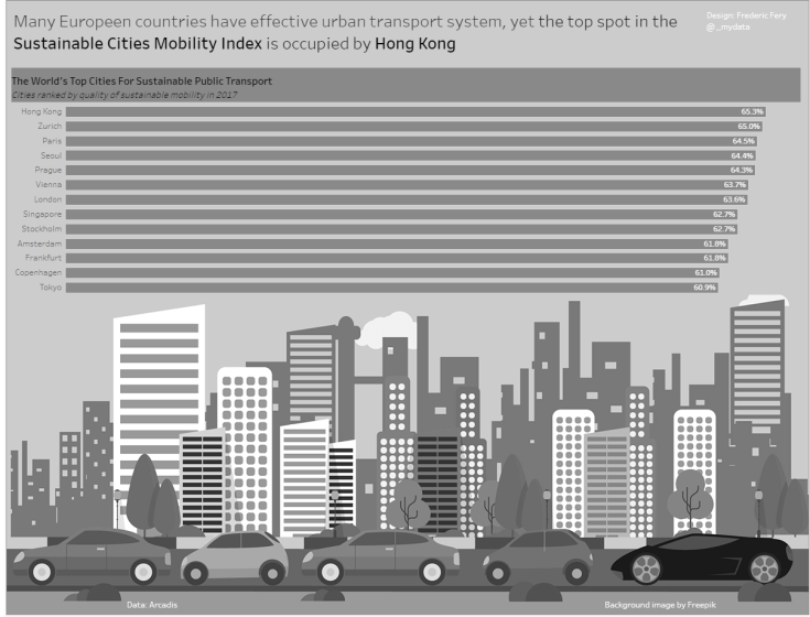
After posting the vis to Twitter and asked for feedback, Eva was concerned about my choice of image. Cars for sustainable transport, I then changed and almost re-done my vis using a brand new image

It still has cars but I think might work better for the sustainable transport theme?
Feedback from Andy and Eva
- Main image too big and distracting
- Typos (sorry spelted Europeen the French way)
- More space for the data, not image
- Divide the story with top 10, then 7 European cities then Hong Kong
- Separate the 7 European countries visually
- Use city term not countries
Final vis


Leave a comment