
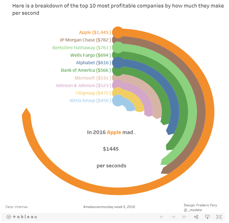
This week Makeover monday the challenge was to visualise data from Titlemax, most profitable companies and how much they make per seconds
I decided to learn something new and made a Radial Pie Gauge Chart in Tableau following this excellent tutorial from SuperDataScience. More great tutorials from their sites too.
I’m not sure if this type of chart was the best, but I enjoyed learning. I’m not super happy with it, but with limited time, that’s ok

Leave a comment