
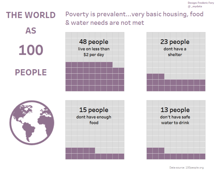
This week for Makeover monday week 48 we were asked to visualise data from 100people.org: The world as 100 people
To keep with my Tableau tradition, I decided to learn a new trick.
This week I wanted to learn how to make Waffle Charts.
I found a great tutorial from Andy’s Tableau tip Tuesday
What worked:
- Getting the waffle template was pretty straightforward
- Data was quite simple to use
Where I struggled:
- When I brought the real data set and had to create the few calculations
Solution:
- Luckily Charlie Hutcheson came to the rescue and via Twitter guided me through the process and got my calc worked out
- the next step was vis layout, colors..
My vis – vis url

Leave a comment