This is an interesting topic - Based on a report from ATO (Australian Tax Office), lots of very rich Australian companies don't many corporate taxes, even if they generate lots of profits. Many many miners seems to be playing this game. I wanted to visualise the BIG ZERO TAX as well as big profit. My... Continue Reading →
Radial Pie Gauge Chart in Tableau
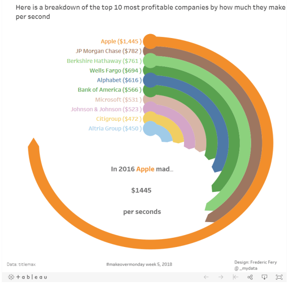
This week Makeover monday the challenge was to visualise data from Titlemax, most profitable companies and how much they make per seconds I decided to learn something new and made a Radial Pie Gauge Chart in Tableau following this excellent tutorial from SuperDataScience. More great tutorials from their sites too. I'm not sure if this type... Continue Reading →
Tableau geometric art experiment
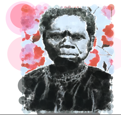
Thanks again to the #makeovermonday community I got inspired by Ken Flerlage work on his 2017 Year of learning post, and more specifically this work on Tableau geometric art. Ken is truly inspirational. I have never seen this done in Tableau before! #Fridayfun, I decided to have a go following the great tutorial from his... Continue Reading →
The world as 100 people
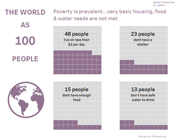
This week for Makeover monday week 48 we were asked to visualise data from 100people.org: The world as 100 people To keep with my Tableau tradition, I decided to learn a new trick. This week I wanted to learn how to make Waffle Charts. I found a great tutorial from Andy's Tableau tip Tuesday ... Continue Reading →
American teens’ favorite social media app
This weeks MakeOver Monday #47 we were asked to visualise data from Business Insider about American teenagers use of social media pp, and specifically which app they prefer The original vis is below What I like: seems easy enough to get the story nice layout can really see the surge for Snapchat What I would... Continue Reading →
Sustainable Cities Mobility Index
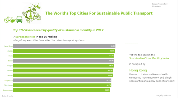
For this week Makeover Monday Week 46 we were asked to visualise data from Sustainable Cities Mobility Index (Arcadis report) What I like about this vis: Easy to understand Nice layout What to change: Not sure actually, maybe the green a flags (which aren't city flags) My attempt: As I always try to learn something... Continue Reading →
Life Expectancy at Birth by Country
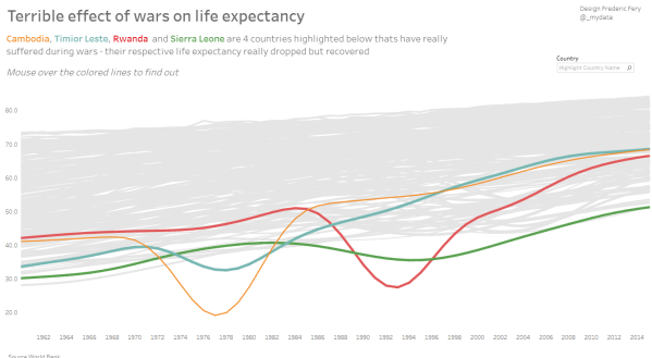
In this Makeover monday week 45, we were asked to visualise Life Expectancy at Birth by Country data from the World Bank My plan: As I try to learn new Tableau tricks I decided to follow Andy's tutorial to create Small multiple line charts, also adding dynamics labs following this tutorial from the Info Lab... Continue Reading →
Public holidays in the world
This week MakeoverMonday was about to visualise public holidays in the world (data source) This week I have learnt a new Tableau technique: full year calendar heatmap. I was a bit stuck and short of time this week, but took inspiration from Kate Brown's calendar It was quite tricky technically, but with help from the... Continue Reading →
Best jobs for all Myers-Briggs personality type
This week Makeover Monday was about visualing Myers-Briggs personality type Not really inspiring but I still had a go. This week I took the occasion to practice with Tableau Tree Map and tool tips. Live vis link is kindy teacher and nurse Vis: https://goo.gl/c4cCTX
Thanks to the obesity in the USA I learned about Tableau Hex-tile map
Makeover Monday week 41 was about visualising Adult Obesity in the United States. (data) My initial thoughts: It would have been very fun to do this during the live Makeover Monday at #data17 but I don't think I would have time to learn much. So I took this opportunity to learn new Tableau tricks. I... Continue Reading →

