Learning filled shape charts in Tableau

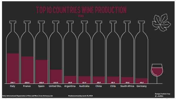
Tableau learning never stops! For Makeovermonday week week 14 Wine production I had in mind using Bora's custom shapes tutorial as per below screen shot.. But I sort of got confused, got stuck with custom shapes, ended up confused, too complicated...and the week went by and forgot about it. While doing research for this weeks... Continue Reading →

Tableau data story telling day for QUT students

On the 8th of March 2018, 80 cross-discipline QUT students came together to tell stories using the data software Tableau. Tableau is a business intelligence software that transforms data into actionable insights. Data presentation is a skill in high demand, having recently been identified by Linked In as a top skill employers need most in candidates. The day was divided into... Continue Reading →

The world as 100 people

This week for Makeover monday week 48 we were asked to visualise data from 100people.org: The world as 100 people To keep with my Tableau tradition, I decided to learn a new trick. This week I wanted to learn how to make Waffle Charts. I found a  great tutorial from Andy's Tableau tip Tuesday  ... Continue Reading →

Life Expectancy at Birth by Country

In this Makeover monday week 45, we were asked to visualise Life Expectancy at Birth by Country data from the World Bank My plan: As I try to learn new Tableau tricks I decided to follow Andy's tutorial to create Small multiple line charts, also adding dynamics labs following this tutorial from the Info Lab... Continue Reading →

Public holidays in the world

This week MakeoverMonday was about to visualise public holidays in the world (data source) This week I have learnt a new Tableau technique: full year calendar heatmap. I was a bit stuck and short of time this week, but took inspiration from Kate Brown's calendar It was quite tricky technically, but with help from the... Continue Reading →

Website Built with WordPress.com.

Up ↑