
Tableau learning never stops!
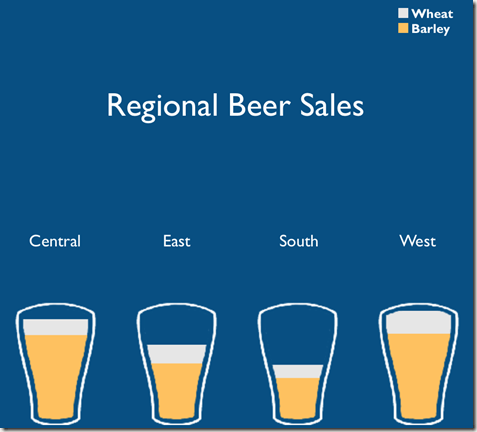
For Makeovermonday week week 14 Wine production I had in mind using Bora’s custom shapes tutorial as per below screen shot..
But I sort of got confused, got stuck with custom shapes, ended up confused, too complicated…and the week went by and forgot about it.
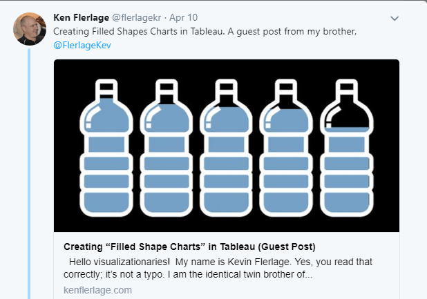
While doing research for this weeks #makeovermonday Artic Sea Ice, I came across this post from @flerlagekr promoting a blog from his brother @FlerlageKev
Create filled shapes charts – BINGO!
An other Tableau lightbulb moment, YES that’s what I need!
I got cracking and followed steps by steps instructions from Kevin.
The key thing was for me to understand that the background image (wine bottle with a transparent background) was actually sitting on the top of the chart in the dashboard itself – not a custom shape. Then the rest followed quite nicely.
It is a tedious process to align the bar chart with all the bottle image and find the right size, play with color…
Next step if I have some time is to work out how to achieve tool tips.
But I got there at the end
Live Vis: goo.gl/uPB1qt
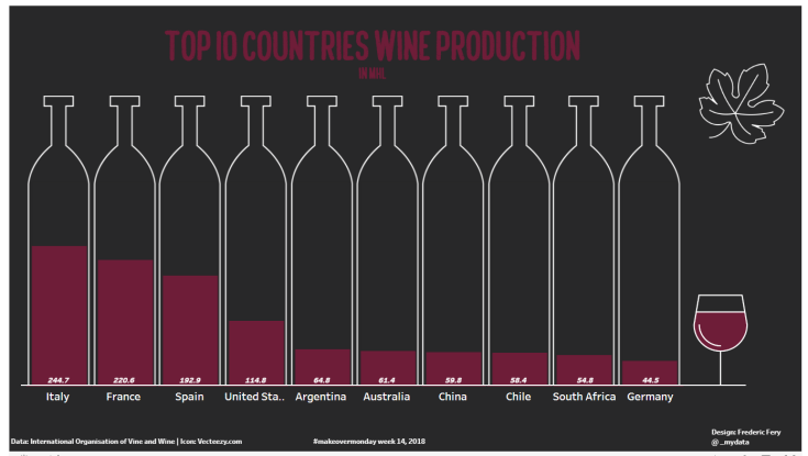
Again thanks to @flerlagekr @FlerlageKev

Leave a comment