
This has been a strange year indeed, but very very Tableau rich for me. Thanks Josh for the very nice #VizInReview visual above
104 new Vizzes – and reached 200 in total on my Tableau Public profile
1 X Viz Of the Day (#VOTD) with “My 1000 Runs – mapping 1000 runs – 10 years”
52 weeks of Makeover Monday
- Completed the 52 weeks of Makeover Monday, see Twitter Moments
- I stuck to 30 min to 1 hour time limit max and due to timezones constraints could not spend too much time participating in the review process. I still found the experience very rewarding – learned a lot in the process.
- See below slide show showing the 52 weeks screen shots.

Week 1 
Week 2 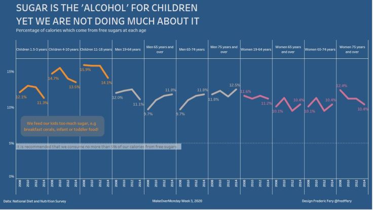
Week 3 
Week 4 
Week 5 
Week 6 
Week 7 
Week 8 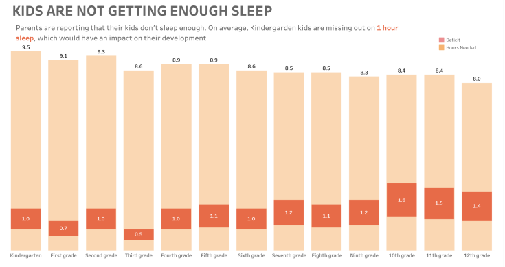
Week 9 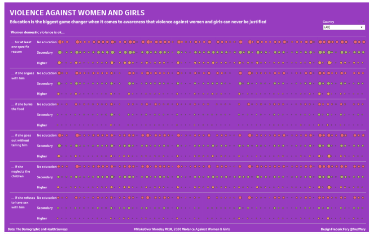
Week 10 
Week 11 
Week 12 
Week 13 
Week 14 
Week 15 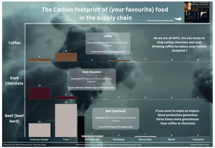
Week 16 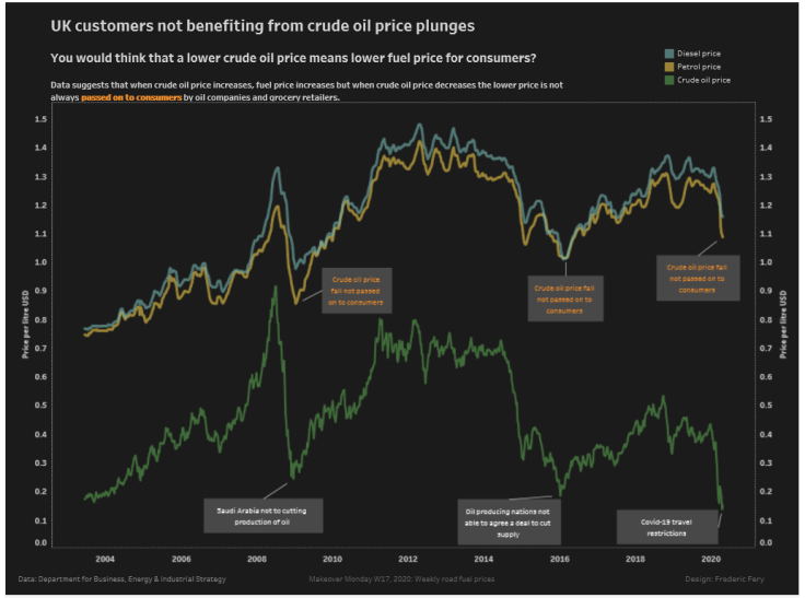
Week 17 
Week 18 
Week 19 
Week 20 
Week 21 
Week 22 
Week 23 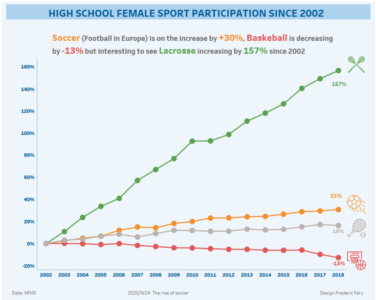
Week 24 
Week 25 
Week 26 
Week 27 
Week 28 
Week 29 
Week 30 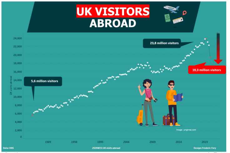
Week 31 
Week 32 
Week 33 
Week 34 
Week 35 
Week 36 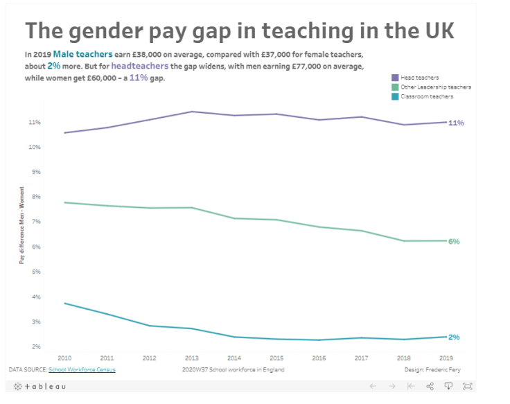
Week 37 
Week 38 
Week 39 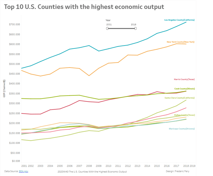
Week 40 
Week 41 
Week 42 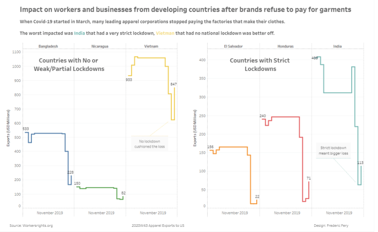
Week 43 
Week 44 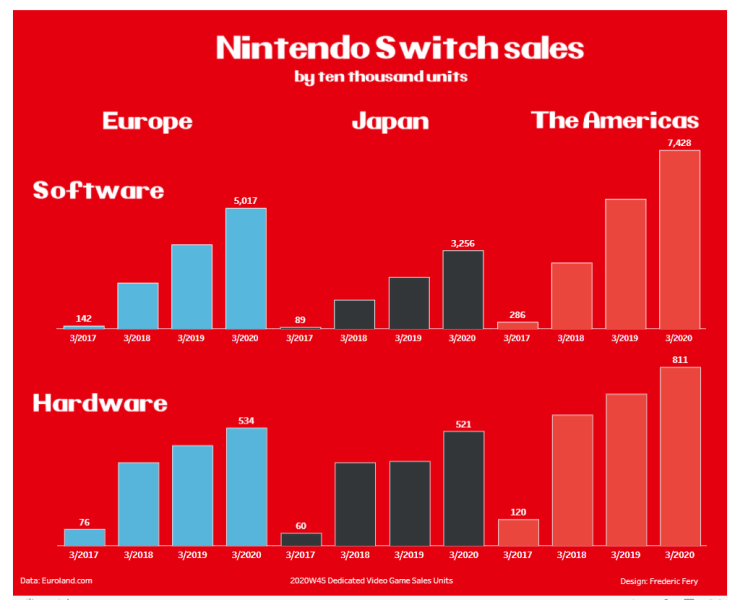
Week 45 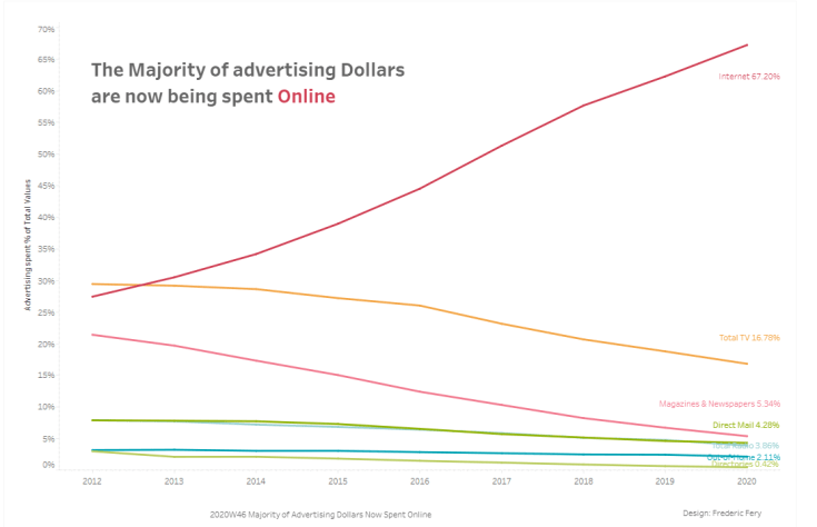
Week 46 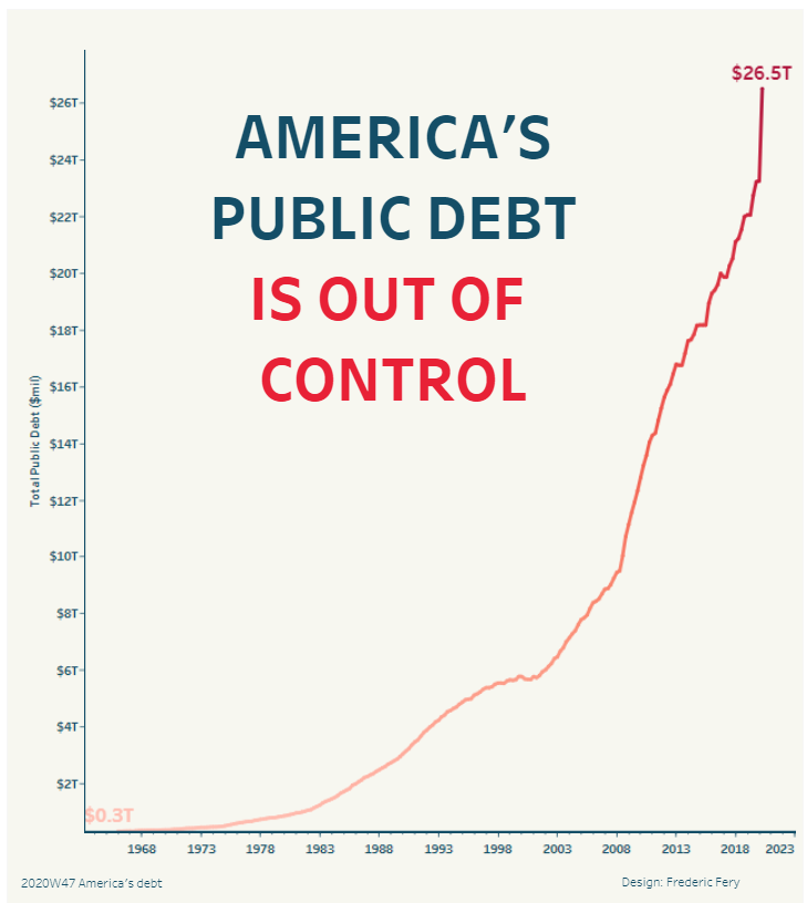
Week 47 
Week 48 
Week 49 
Week 50 
Week 51 
Week 52
IronQuest
Managed to participate in all 4 IronQuest data challenges this year. Including a great collab with Fred Najjar and Sarah for this great challenge
Including the latest Black and White challenge – “White Australia has a black history“

Viz For Social Good
I joined the VFSG Board early this year. I have helped organise a few projects this year and hope to have contributed to improving data literacy, inspired data volunteers and helped a few organisations.
This has been quite busy but very rewarding year for data for social good!
I developed this tracker for the latest internal project, we were visualising our data data, eg all submissions since 2017.

The most challenging and frustrating data viz for me this year was ‘The Emigrants of the World, 1858. By Charles Joseph Minard‘ – I really love maps and really love Minard and spend huge amount of time experimenting with “old style map” style with Mapbox.

I also delivered a few Tableau guest lectures at QUT, my local University. This involved delivering Tableau test drives training sessions to university students.
I am also leading for the first time the Brisbane Tableau User Group – we only met once virtually but hope to come back in 2021.
I was also lucky to be invited by Caroline to present my 1000 Run viz at the Tableau Conference, great experience!

…and I attended early in the year my first PowerBi training course and loved it. I’m not a PowerBi fan (yet) BUT recognise it is a very good dataviz tool.
And, almost forgot, I landed a job as a Data Analyst – nothing to do with Tableau, I am analysing ServiceNow data with a little bit of PowerBi. This is a still a great experience.
I also created a Tableau resume (inspiration from Francisco Cardoso)

See you all in 2021 for…
- more dataviz fun,
- Viz For Social Good,
- more guest and paid Tableau teaching at my Uni
- and may be a real Tableau job? Working in a Tableau Centre for Excellence (if anyone is reading this!)

Leave a comment