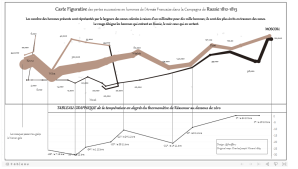
Everyone knows Charles Minard (French civil engineer) for his very famous “La carte figurative des pertes successives en hommes de l’armée française dans la campagne de Russie 1812-1813“; in plain English the map shows Napoleon’s armies disastrous losses during the Russian campaign.
I re-created this map in 2018, I really like this map but also took this as a challenge to learn Tableau – see link on Tableau Public.
I LOVE many of his maps, especially this beautiful “The Emigrants of the World” from 1858.
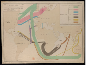
You can check the original version of this map from Gallica.
I was also inspired after reading The Underappreciated Man Behind the “Best Graphic Ever Produced” piece from National Geographic.
I just love colors, content, message and decided the re-create this in Tableau, not without challenges….
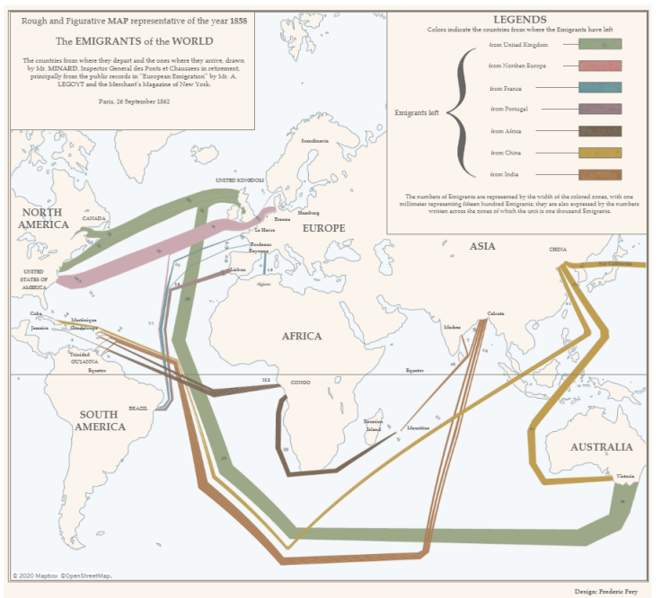
The Final result published on Tableau Public is below.
Tools I used:
- Geojson.io to draw the shapes.
- Excel to create a dataset based on the flow and to also include more information not contained in Geojson.
- Tableau to assemble the visualisation and have fun with style, colors…
- Mapbox to include a custom style.
First, drawing the shapes/polygons flow with Geojson
- Draw polygons manually (yes one by one you read it!) following the real map, this will be very very fiddly. If there is be a better way to do this let me know. I tried to use QGIS but it was pretty confusing. One thing I have learned is that Shapefiles do not support true parametric curves (read this) so creating curves/flow is a very very painful manual process.
- I even tried to print the real map on tracing paper and stuck in on my monitor screen to give me the rough lines. Fun!
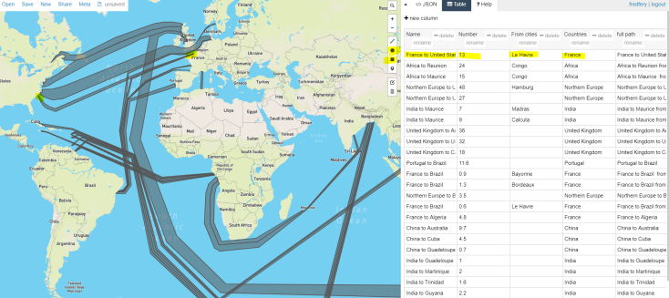
- When you draw your polygons, make sure you select “Table” on the right hand side and create appropriate “Columns”, (Names, full path, numbers…) and enter your data accordingly. You will need this in Tableau.
- Make sure you save your project on GitHub Gist, my files are saved on the repository.
- When you are happy with your polygons, go to “Save” from top navigation, then choose “Save as Shapefile” and save the files to your computer (from Save option at the top) – I included the zipped file that should include the POLYGON.shp file and three other files (keep the four files together)
In Tableau
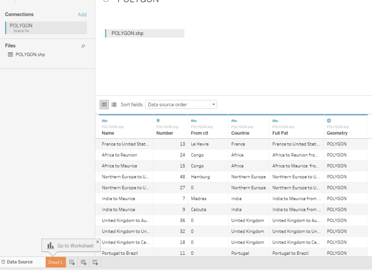
- In the “Connect” section, choose “Spacial file” and connect to the POLYGON.shp from your computer. You should see this:
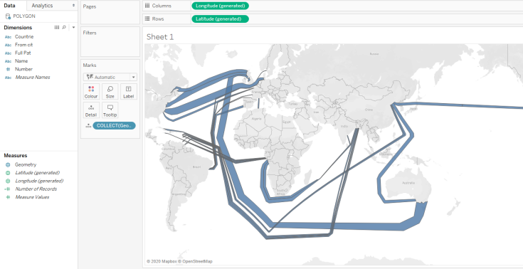
- Then on Sheet 1, double click on Geometry Measures, and you should see this below – VOILA almost there!!
- I believe Minard took a few shortcuts when he drew his map. For example North America, Australia and Europe look disproportionately large. Map projections also might cause you some concerns when importing the shape files to Tableau. If you look at my Tableau Public link, the flows going from India are completely off. ( I think it is to do with projections and the globe curves?. If someone knows, let me know)
Now in Excel
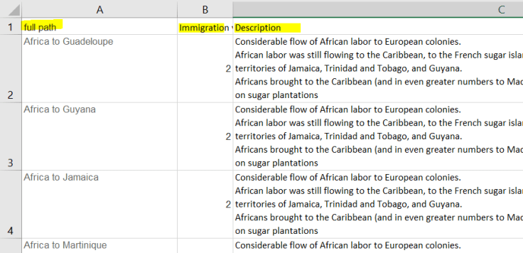
- I also wanted to include a bit more information for each migration flows. So when people mouse hover a flow, a Tooltip would give more information. As I wasn’t sure if these could be done in Geojson, I connected a separate Excel file (below structure) and joined them using the full path field.
- I also found it easier to have the “description” information in a different file, so I could change content at leisure, rather than going via Geojson and export the .shp file again.
- The rest of the process is really about the design, colors, font style, labels, buttons as shapes for the labels box, Tootips and various cosmetics bits and pieces.
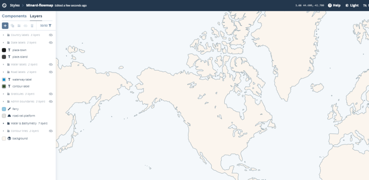
Custom Mapbox map
- I also created a custom Mapbox style (below) that I’m happy to share too (Mapbox Minard-flowmap)
I hope you found this useful and would be inspired to re-create this map or an other one from Minard.
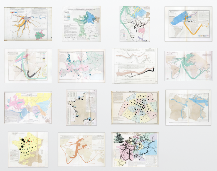
There is plenty to choose from, have a look at Sandra Rendgen’s blog, “The Forgotten Maps of Minard”.