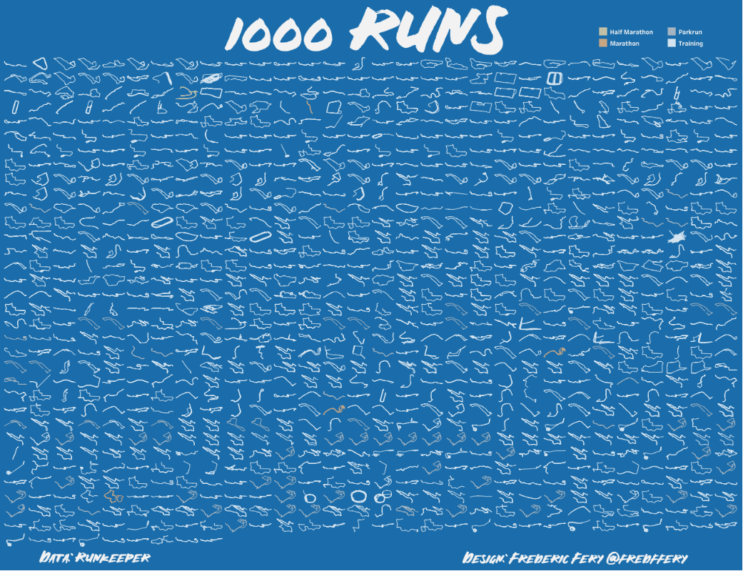

I love running and I love Tableau so I made a dashboard full of runs.
This post describes how I have made this Tableau data visualisation.
It ended with Tableau Viz of The Day, great honor too!
Data
Firstly you need to run or walk A LOT and track your activities with a GPS watch or GPS smartphone app.
You also need to have your data saved to RunKeeper, Strava or equivalent and need to be able to export it.
This visualisation is based on Runkeeper data, but if you follow Andry Cotgreave blog post, he is basing his techniques on Stava.
Inspired by the Andy’s
I can’t recall if I saw Andy Cotgreave blog post or Andy Kriebel first but I decided that was a nice Tableau (and personal) challenge to tackle.
It took me 10 years to get to the 1000 runs mark (I was running before without a GPS watch!) and started to work on this project in January 2020. At the time, I was hoping to be ready for #SportsVizSunday as I thought I had already reached the 1000th run mark, but I realised (thanks to Tableau data cleaning process) that runs had been duplicated in Runkeeper (Probably because of the Garmin Connect Sync issue).
Data export as GPX
For Runkeeper, it is very easy to export your own data. Go to your Account settings and choose the dates from/to and click Export the data. You will end up with a zip file full of GPX files.
GPX files conversion
As Tableau can’t read GPX files directly (I think), these need to be converted. I found this very useful blog that explained some of the process and got me started.
The tool I used is called GPX Visualiser. You basically upload the GPX files, pick a few settings and the tool will convert to a text file. If you go to ‘Advanced Settings’ make sure you Connect the Segments, merge all tracks and check time offset (if time zone is not correct). GPX Visualizer will generate a text file that you will be able to be open in Excel. (and import to Tableau)
Now, the ‘not so fun’ part, data prep!
It wasn’t too much fun because (1) there was lots of runs (1000 to be precise), 600,000 + rows of data and (2) the data prep for me was done manually – Export from Runkeper, GPX converter and make the Excel file.
I’m sure most could be done using Tableau Prep, Alteryx or equivalent programming techniques but I don’t really have the data prep skills or tool (Alteryx)
I have included in this post a sample Excel data as a guide.
The structure of the data file is the following:
| RunID | Manual, one number for each runs, from 1 to 1000 – kind of obvious
It could have been done programmatically I’m sure. |
| type | Manual, e.g., Training, Marathon, Parkrun – used to sort the runs as labels |
| time | From Runkeeper. I had to convert to ‘Time rounded’ as some runs came with the completely wrong time zones (could have done this in Tableau I’m sure) |
| Time rounded | As per above |
| Latitude | From Runkeeper and GPX Visualizer, used to map the paths |
| Longitude | From Runkeeper and GPX Visualizer, used to map the paths |
| altitude (m) | From Runkeeper and GPX Visualizer but didn’t use it |
| speed (km/h) | From Runkeeper and GPX Visualizer but didn’t use it. Very strange data came back from Runkeeper (eg 1000 km/h speed…which must be due to satellite connection issues!) |
| pace (min/km) | From Runkeeper and GPX Visualizer. Same content as above with data inaccuracies due to satellite I think. |
| distance (km) | From Runkeeper and GPX Visualizer – In theory add this field to come up with total run distance but didn’t work (used the Total KM field) |
| distance_interval (m) | From Runkeeper and GPX Visualizer |
| name | Manual, if you want to give your run a name e.g. Brisbane Marathon |
| Total KM | Manually copied from Runkeeper individual activities, as I found adding the distance (km) field didn’t add up. |
| Race time | Was only used for races but ended up using a calculation using the time field |
Then into Tableau, that’s the fun bit!
As mentioned above, you can follow Andy’s tutorial and/or download the Tableau file from Tableau Public to work out the magic.
First tip, as there is lots of marks, make sure you have a data source filter and include only a few runs (as it will get very very very sloooooooow)
Below is the Tableau workbook with the amazing calculations from Andy. The trellis field is important too. You can also include your own fields for the Tooltips, Labels…

I also had troubles with time calculations and time formatting. I was trying to calculate the difference between start time and finish time for each run ID and format as hh:mm:ss (not ‘I ran 240 minutes!’) I got great help in the Tableau Forum.
I also wanted to generate a map for each runs. As you roll over one path, a small map is showed as tooltip. It created a few issues too, as map didn’t want to resize. I must admit I can’t recall how I solved it but the code for the map tool tip is below.
<Sheet name=”MAPS all runs” maxwidth=”300″ maxheight=”300″ filter=”<RunID>”>

This is the workbook screen shot for the map. Note, the map size is not fixed.
I also ended up creating a real data dashboard and accident art chart which I might publish later. Have fun and a good run.


Leave a comment