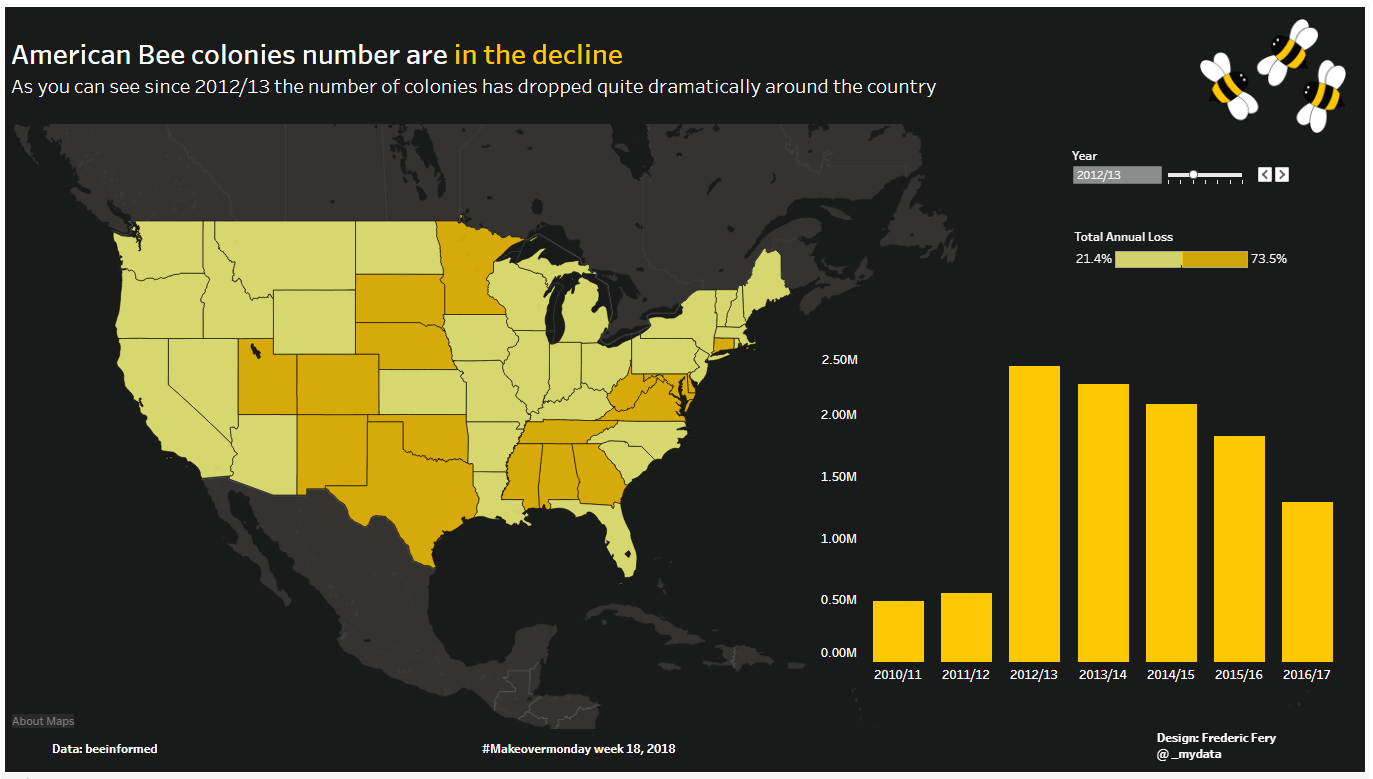
Who would have thought I would know that bee colonies are in the decline in the US.
Thanks to Tableau #makeovermonday social data project, I feel a bee more informed!
This week’s data from Bee Informed highlighted Colony loss in the USA.
My live visualisation on tableau public.

I originally opted to use a Hex map, as many participants did this week, see below what it could have looked like

But I finally choose a normal map, as I thought the story was a bit easier to understand.
I like Hex map and many did last week but I thought data story was not flowing as easily.
What do you think? happy to have comments

Leave a comment