
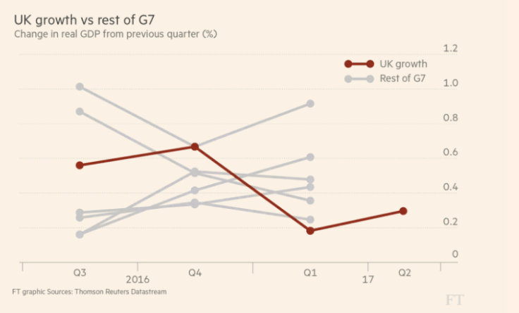
For this Makeover Monday week 40 we were asked to remake this chart from The Financial Times about the growth of the UK economy vs. other G7 countries
My first thoughts:
- I have only been makeovermonday’ing for a few weeks only. I’m learning a lot. Thanks for the great feedback.
- Time permitting, one of the first things I do when I get to work is to check what type of data has been made available.
- My first impressions – Economy stats? hmm, ok, why not. It will be fun!
My goals:
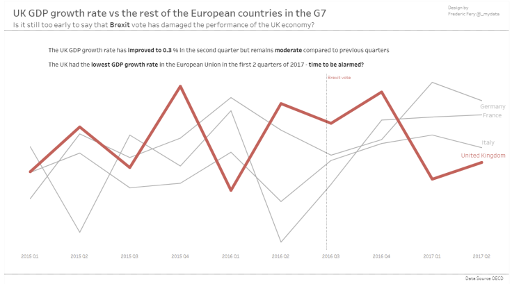
- I wanted to group 4 European countries – UK, Germany, France and Italy and only choose data from 2015 only
- Keep the dashboard simple, no fancy colors, photos…flags…
What I could improve:
- Include country flags (I know I contradict myself) and may be more visual cues to improve story telling
What I like (I think!):
- Simple, may be too simple

Feedback from Eva and Andy
- Tooltips: % 2 decimal points and same font and size
- Added “Vote” after Brexit
- Bring UK red line to the front and use color or shade labels
Learned a few new tricks:
- match mark colors in labels
- Use sets
My second vis submission

Leave a comment