Going going gone. My time at QUT will finish this Friday after 13 years or 5030 days. I decided to visualise my journey below with hashtag#tableau Thanks to my team and all my QUT colleagues; next step is a job with QLD Health https://public.tableau.com/profile/fredfery#!/vizhome/5030daysatQUT/5031days BIG THANKS team Joseph BarrowcliffeKathryn HeiserJulia MackerrasEmma YerburyGina Palmer + Dan... Continue Reading →
Tableau iron viz
My very first tableau #ironviz has been submitted "Fix our water!" First @tableau #IronViz story raises the issues Aboriginal and Torres Strait Islander peoples in Australia are facing with poor water/sanitation Inhumane I started to collect data about the drought in Australia and impact on farmers, but an article from the Conversation attracted my attention.... Continue Reading →
My first Football World Cup of Tableau in 8 stories (and 2 stars)
I have been a big fan for Football (soccer for some of you) for a very long time, but this is my very first Tableau Football World Cup. This is also the first time I create dashboards with Tableau and my team France wins **, so it must be a sign! I live in Australia and... Continue Reading →
Merci Arsene – Tableau visualisation
After spending 22 years in the English Premier League Arsene Wenger is leaving Arsenal as a true legend of the game. Live visualisation #SportsVizSunday @Arsenal @premierleague #tableau
Visualising UEFA Champions League winners since 1955
As part of, #sportVizSunday, I have used Tableau to visualise UEFA Champions League winners since 1955 @realmadrid has done it again with 13th victories and 3 in a row for master #Zidane Live visualisation -> https://goo.gl/zCGkZi thanks @flerlagekr for sankey tutorial
Fifa World Cup results 1982 – 2014
Sunburst chart sunday experiment & tutorial: @kirill_eremenko, #SportsVizSunday Live visualistion: https://goo.gl/95q5n1
Tableau helped me learn about bee colonies! but which map to choose?
Who would have thought I would know that bee colonies are in the decline in the US. Thanks to Tableau #makeovermonday social data project, I feel a bee more informed! This week's data from Bee Informed highlighted Colony loss in the USA. My live visualisation on tableau public. I originally opted to use a Hex map, as many participants did this week,... Continue Reading →
Learning filled shape charts in Tableau
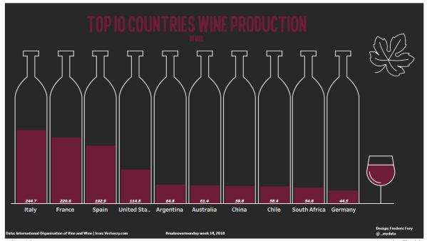
Tableau learning never stops! For Makeovermonday week week 14 Wine production I had in mind using Bora's custom shapes tutorial as per below screen shot.. But I sort of got confused, got stuck with custom shapes, ended up confused, too complicated...and the week went by and forgot about it. While doing research for this weeks... Continue Reading →
Tableau data story telling day for QUT students
On the 8th of March 2018, 80 cross-discipline QUT students came together to tell stories using the data software Tableau. Tableau is a business intelligence software that transforms data into actionable insights. Data presentation is a skill in high demand, having recently been identified by Linked In as a top skill employers need most in candidates. The day was divided into... Continue Reading →
Australian companies don’t pay taxes
This is an interesting topic - Based on a report from ATO (Australian Tax Office), lots of very rich Australian companies don't many corporate taxes, even if they generate lots of profits. Many many miners seems to be playing this game. I wanted to visualise the BIG ZERO TAX as well as big profit. My... Continue Reading →


