Going going gone. My time at QUT will finish this Friday after 13 years or 5030 days. I decided to visualise my journey below with hashtag#tableau Thanks to my team and all my QUT colleagues; next step is a job with QLD Health https://public.tableau.com/profile/fredfery#!/vizhome/5030daysatQUT/5031days BIG THANKS team Joseph BarrowcliffeKathryn HeiserJulia MackerrasEmma YerburyGina Palmer + Dan... Continue Reading →
Tableau iron viz
My very first tableau #ironviz has been submitted "Fix our water!" First @tableau #IronViz story raises the issues Aboriginal and Torres Strait Islander peoples in Australia are facing with poor water/sanitation Inhumane I started to collect data about the drought in Australia and impact on farmers, but an article from the Conversation attracted my attention.... Continue Reading →
My first Football World Cup of Tableau in 8 stories (and 2 stars)
I have been a big fan for Football (soccer for some of you) for a very long time, but this is my very first Tableau Football World Cup. This is also the first time I create dashboards with Tableau and my team France wins **, so it must be a sign! I live in Australia and... Continue Reading →
Merci Arsene – Tableau visualisation
After spending 22 years in the English Premier League Arsene Wenger is leaving Arsenal as a true legend of the game. Live visualisation #SportsVizSunday @Arsenal @premierleague #tableau
Visualising UEFA Champions League winners since 1955
As part of, #sportVizSunday, I have used Tableau to visualise UEFA Champions League winners since 1955 @realmadrid has done it again with 13th victories and 3 in a row for master #Zidane Live visualisation -> https://goo.gl/zCGkZi thanks @flerlagekr for sankey tutorial
Fifa World Cup results 1982 – 2014
Sunburst chart sunday experiment & tutorial: @kirill_eremenko, #SportsVizSunday Live visualistion: https://goo.gl/95q5n1
Why do I think Tableau rocks?
Updated 24/12/2021 Disclaimer: I don’t own any Tableau Salesforce shares (may be I should) and I don’t work for Tableau (may be I should) or work in the data field (may be ...) Since Oct 2021, I have started to work for Big W (retail chain in Australia) as a Data Visualisation Manager and lucky... Continue Reading →
Tableau helped me learn about bee colonies! but which map to choose?
Who would have thought I would know that bee colonies are in the decline in the US. Thanks to Tableau #makeovermonday social data project, I feel a bee more informed! This week's data from Bee Informed highlighted Colony loss in the USA. My live visualisation on tableau public. I originally opted to use a Hex map, as many participants did this week,... Continue Reading →
Learning filled shape charts in Tableau
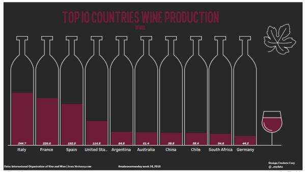
Tableau learning never stops! For Makeovermonday week week 14 Wine production I had in mind using Bora's custom shapes tutorial as per below screen shot.. But I sort of got confused, got stuck with custom shapes, ended up confused, too complicated...and the week went by and forgot about it. While doing research for this weeks... Continue Reading →
Tableau data story telling day for QUT students
On the 8th of March 2018, 80 cross-discipline QUT students came together to tell stories using the data software Tableau. Tableau is a business intelligence software that transforms data into actionable insights. Data presentation is a skill in high demand, having recently been identified by Linked In as a top skill employers need most in candidates. The day was divided into... Continue Reading →


