
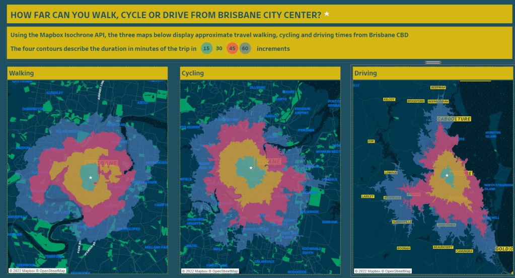
This blog post will explain how I created this drive time analysis data visualisation using Tableau and Mapbox Isochrone API.
I created this viz that was published on Tableau Public.
Firstly, I need to acknowledge the original post from the Flerlage blog: “Travel/Drive-Time Maps in Tableau by Marc Schønwandt“. This post inspired me to learn and use this technique for my work.
What are isochrone maps?
Isochrone maps, from the Greek words iso (equal) and chrone (time), also known as travel time maps, are maps that show all reachable locations within a specified limit by a specified mode of transport.
What are the use cases for travel maps?
For businesses, these could be looking for a place to establish a new office or choose the best place for a new retail shop. For individuals, use cases could be compairing commute times when choosing a place to live or work or book a hotel within a desired travel time from any location.
Mapbox Isochrone API
I choose to use Mapbox, because I was already quite familiar with Mapbox Studio and had an account already. But there are other very good (free) API isochrone providers, such as HERE Isoline Routing API.
The Mapbox API computes areas that are reachable within a specified amount of time from a location, and returns the reachable regions as contours of polygons or lines that you can display on a map. You can calculate isochrones up to 60 minutes using driving, cycling, or walking profiles.
In very plain english, that means that if you walked, drove or cycled for 15 minutes in any directions, how far could you get!
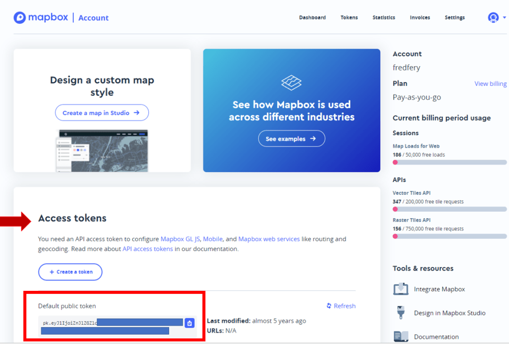
How do you start?
When you login to Mapbox Studio, or register for the first time, go to your Account and find the Access tokens section. Your token will be a very long number starting with pk….something.
Copy this token in a Notepad document and keep it for later.
Next step is to retrieve isochrones around your location
You will need to find the latitude/longitude coordinates of the location you need to analyse. In my example I’m using Brisbane business disctrict as my location, eg
Latitude -27.437847459669598
Longitude 152.94712570778916
Then open notepad, and copy and modify the below URL with the desired parameters (profile, time, token…) – To learn about the various parameters the API offers, check the API guide.

When you are satisfied with your parameters, copy and paste this URL in your browser window. If all goes well, and no errors are displayed, you should see this output in your browser window.
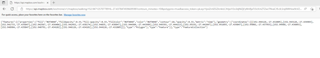
Next, right click in the text in your browser window, and save this JSON file to your computer. You will need this for Tableau. Repeat the operation if you want to generate more profiles (eg one for driving, one for cycling…)
Now the fun part in Tableau!
In Tableau, choose Connect to a file, Spacial File, and open the JSON file saved previously.
Bring the Geometry file to the Detail Marks. You might need to convert the Contour field to a Dimension, then bring Contour to Color. After this, change colors if required.

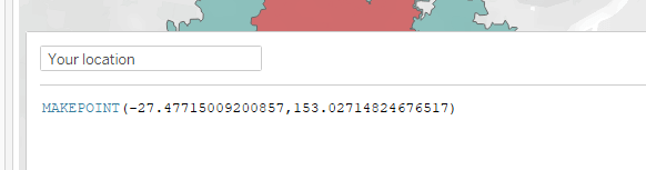
If you want to place your location (the one you used with latitude/longitude) on the map too, create a calculated field using MAKEPOINT and include your Latitude/Longitude as per below.
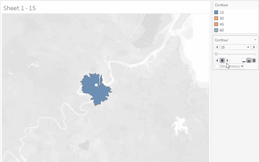
et voila, this is your drive (walking in this example) time analysis showing 15 minutes intervals. The four contour describing the duration of the trip in 15/30/45 and 60 minutes increments.
If you are keen, you can drop the Contour dimension to your Pages Shelf and “Play it back” to create a little animation (not supported on Tableau Public)

This is great! I have a question. I have about 45 points that I would like to create a drivetime for 30, 60 and 90 minutes from the points. How do I do this for multiple points? can I create one json file for the 45 points? or do I have to create 45 json file and link them to tableau and have multiple layers?
LikeLike
hey, not tried multi points
Maybe read this
https://gis.stackexchange.com/questions/378172/creating-multiple-points-on-mapbox-isochrone-map
or https://abhill11.github.io/Lab8_Tutorial_MBIsochroneAPI/
LikeLike