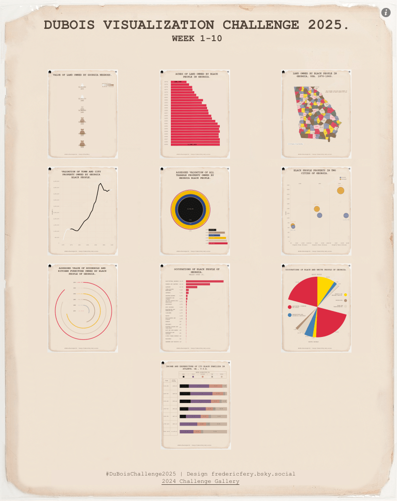
After ten weeks of recreating and reimagining W.E.B. Du Bois’s groundbreaking data visualizations, I’ve completed the 2025 Du Bois Visualization Challenge. This year marked a bit of a shift in my approach compared to the 2024 challenge, as I embraced creative freedom rather than pursuing exact replications. Here’s a look back at this rewarding journey through data visualization history.
Inspiration Over Replication
The key difference in my approach this year was prioritizing the spirit of Du Bois’s work rather than attempting pixel-perfect recreations. In 2024, I focused on meticulously matching every detail of the original visualizations. This time, I allowed myself to take creative liberties while preserving the core message and visual language that made Du Bois’s work so powerful. There were also times, when I could not get Tableau to replicate the exact same charts.
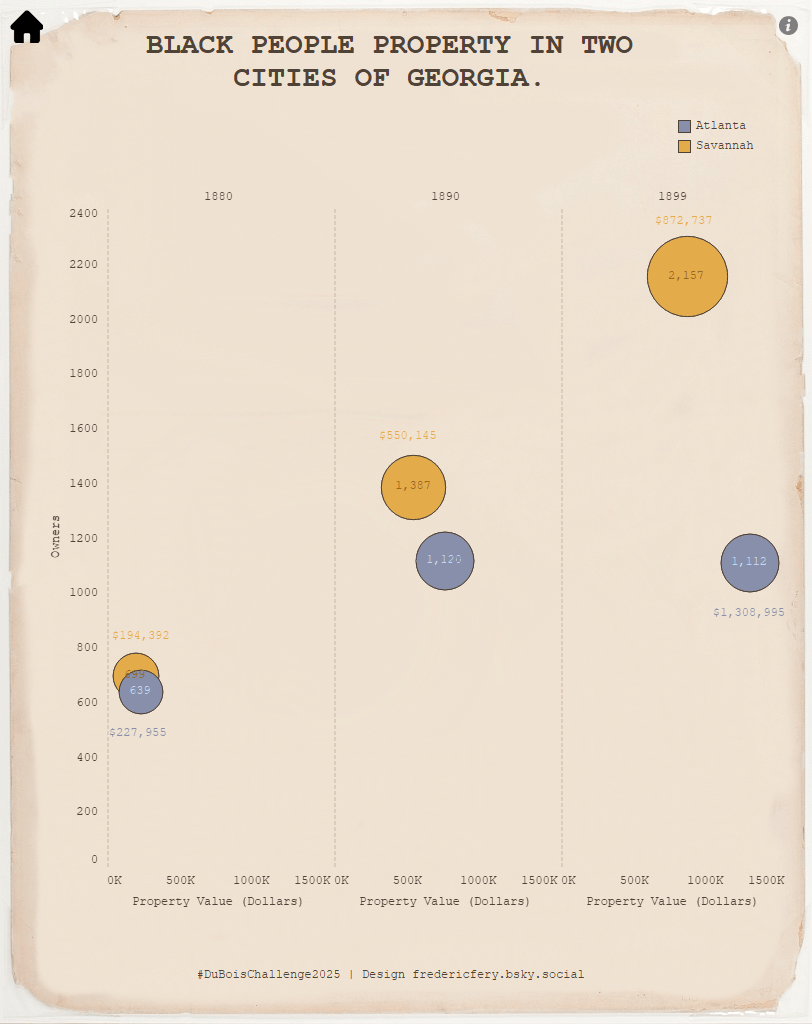
This shift proved particularly liberating for complex charts like Week 6’s “Negro Property in Two Cities of Georgia,” where I created an entirely different visualization that communicated the same data relationships but with modern techniques. Tableau’s out-of-the-box capabilities sometimes limited exact replication, but this constraint pushed me to think more creatively about how to honor Du Bois’s innovative spirit.
Week-by-Week Journey
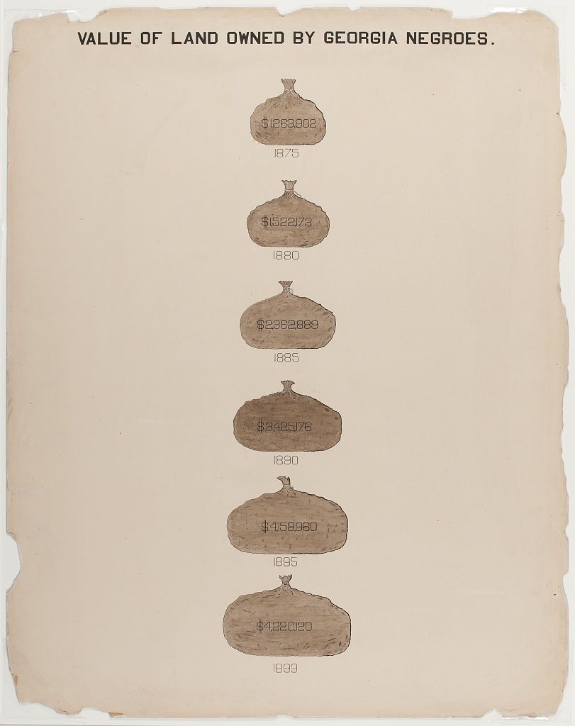
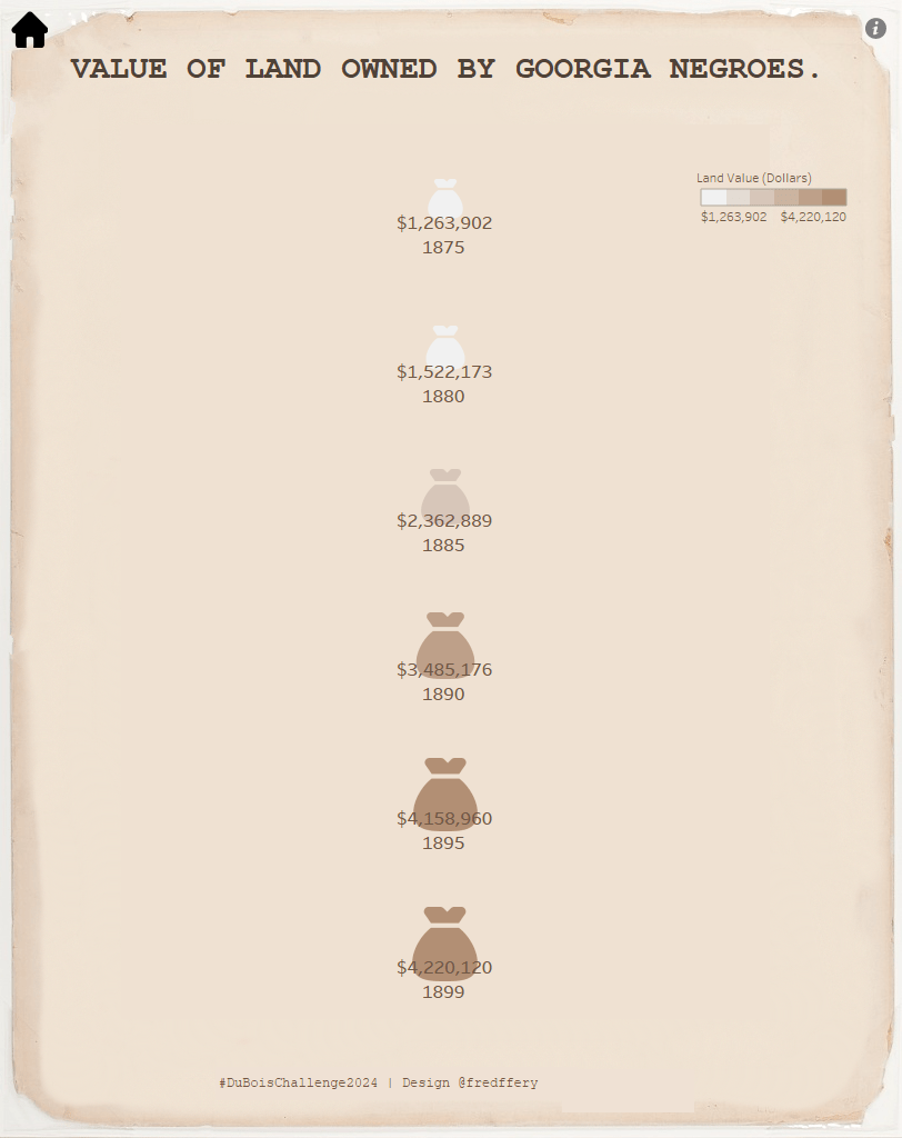
Week 1: Value of Land Owned by Georgia Negroes (Feb 3)
Starting with the money bag visualization showing the dramatic increase in land value over time presented a perfect introduction to Du Bois’s approach to making data relatable. I focused on maintaining the visual metaphor while updating the presentation for modern audiences.
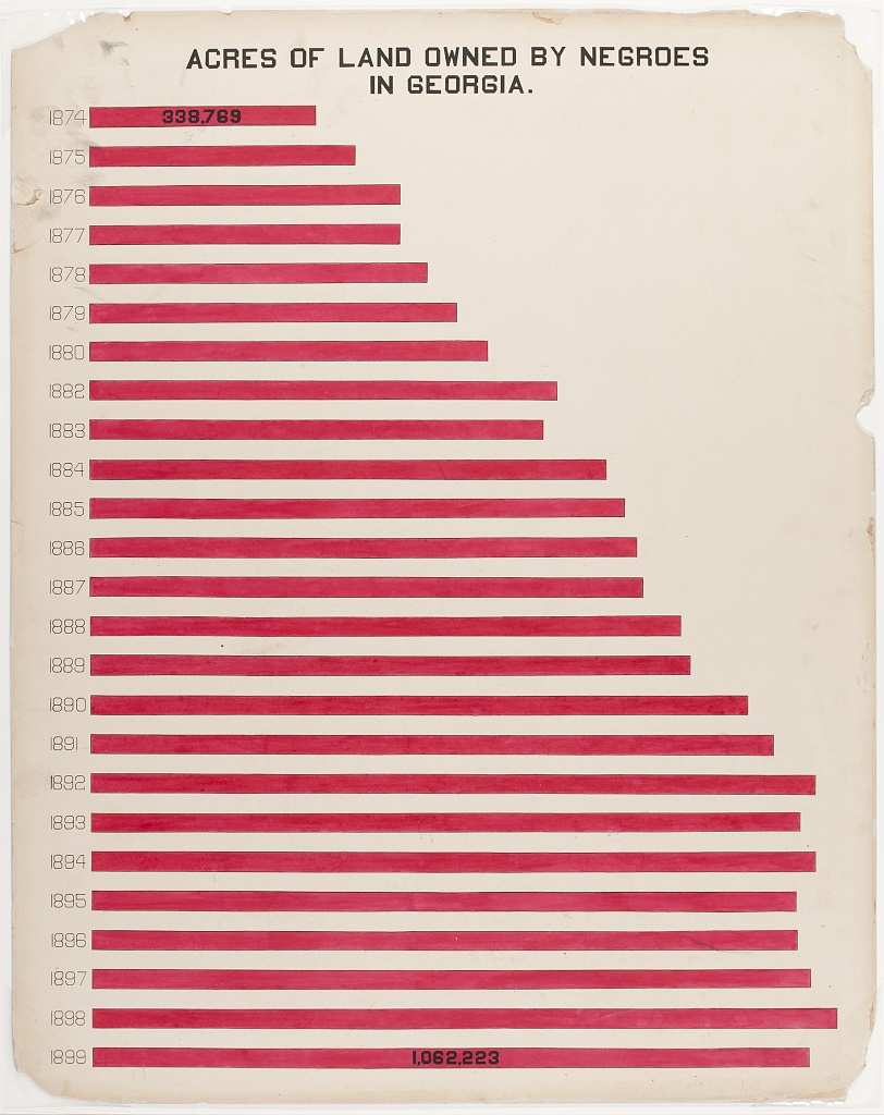
Week 2: Acres of Land Owned by Negroes in Georgia (Feb 10)
The horizontal bar chart showing the impressive growth in land ownership from 338,769 acres in 1874 to over 1,062,223 acres by 1899 required careful attention to the original’s color scheme and proportions, while allowing for clearer data labeling. Also added background textures to the bar charts.

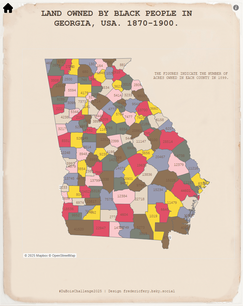
Week 3: Land Owned by Negroes in Georgia, USA, 1870-1900 (Feb 17)
This county-level map visualization challenged me to work with geospatial data in Tableau while maintaining Du Bois’s careful color-coding system that highlighted regional patterns across Georgia.

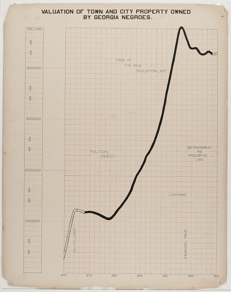
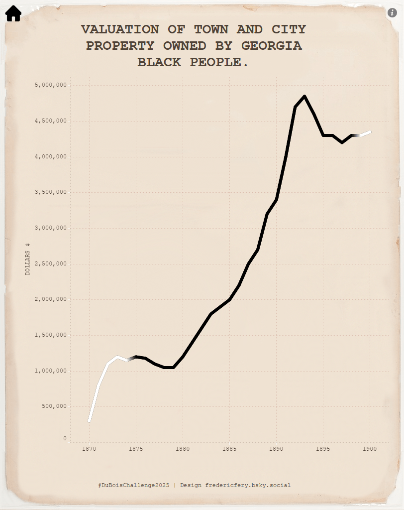
Week 4: Valuation of Town and City Property (Feb 24)
The line chart showing the dramatic growth (and subsequent slight decline) in urban property values demonstrated Du Bois’s skill in showing economic trends. I preserved the stark visual contrast while ensuring modern readability.
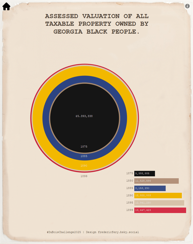
Week 5: Assessed Valuation of all Taxable Property (Mar 3)
The concentric circle visualization presented unique challenges in Tableau, requiring creative approaches to maintain the sense of growth radiating outward while clearly presenting the numerical values. I just could not replicate these “spikes”. I actactally found that chart hard to interpret. In my version, I added a simple bar chart.

Week 6: Negro Property in Two Cities of Georgia (Mar 10)
This was where I took the most creative liberty, completely reimagining the visualization while maintaining the core comparison between property ownership in Atlanta and Savannah. My alternative design preserved (I hope) the data story while using techniques better suited to modern visualization tools.

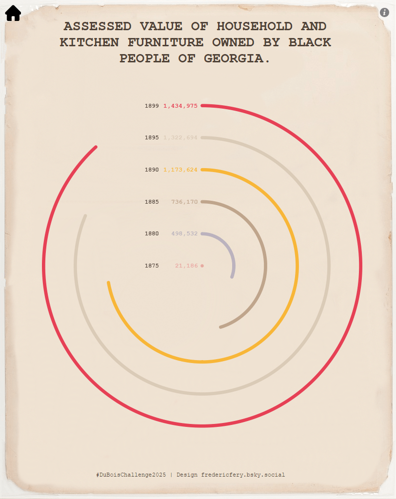
Week 7: Household and Kitchen Furniture Value (Mar 17)
The spiral design showing growth in personal property ownership demonstrated Du Bois’s creative approach to showing progression. I maintained the spiral concept while enhancing readability of the specific values. This chart was also pretty hard to replicate using Tableau’s out of the box features.

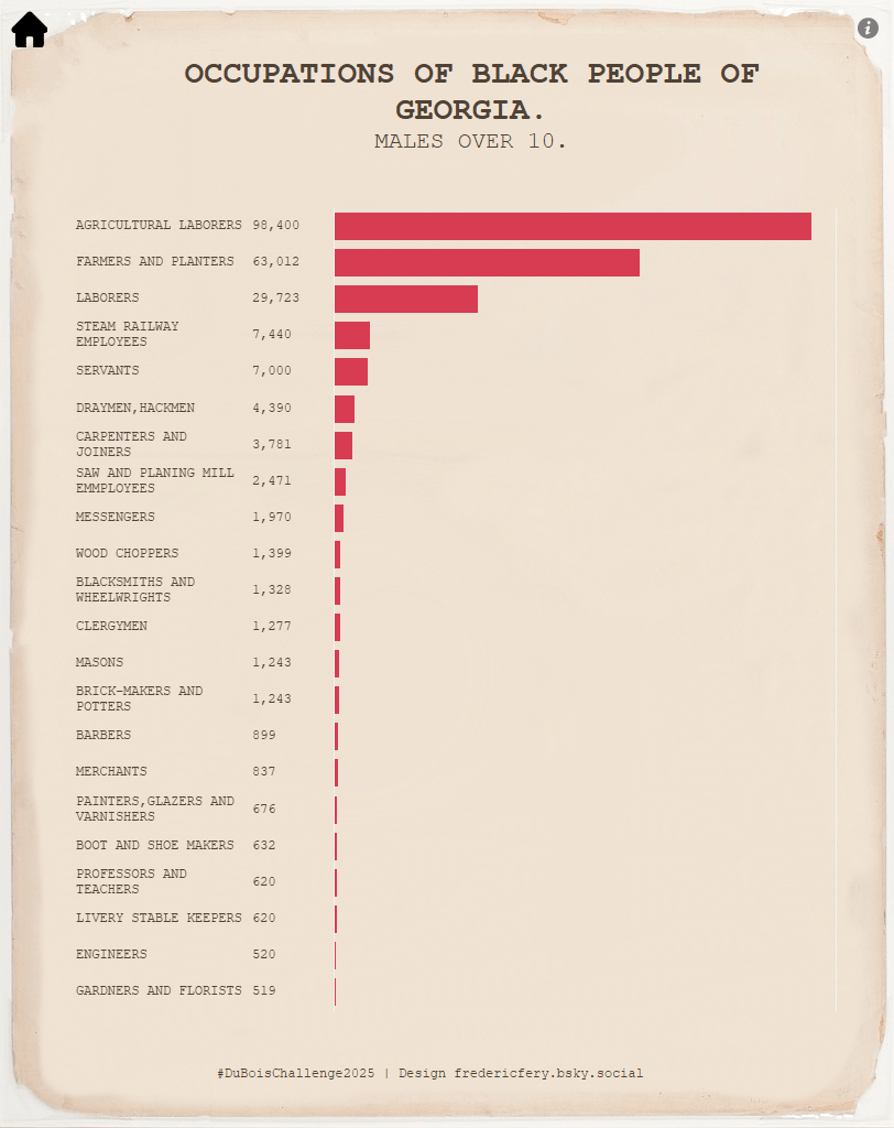
Week 8: Occupations Of Georgia Negroes (Mar 24)
The detailed breakdown of occupations among Black males presented clear hierarchies in workforce participation. I preserved the stark visual display of agricultural dominance while ensuring all the smaller occupational categories remained visible.
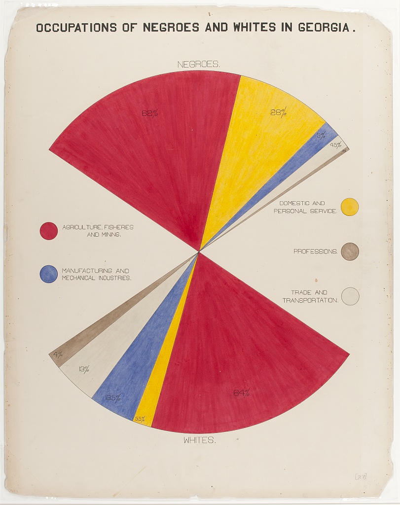
Week 9: Occupations Of Negroes And Whites In Georgia (Mar 31)
The dual pie chart comparing occupational distributions between racial groups represented Du Bois’s commitment to direct comparative visualization. I maintained the clear sectoral divisions while ensuring the percentage labels were prominently displayed. This chart was a fun hack, using black segment for the pie charts.

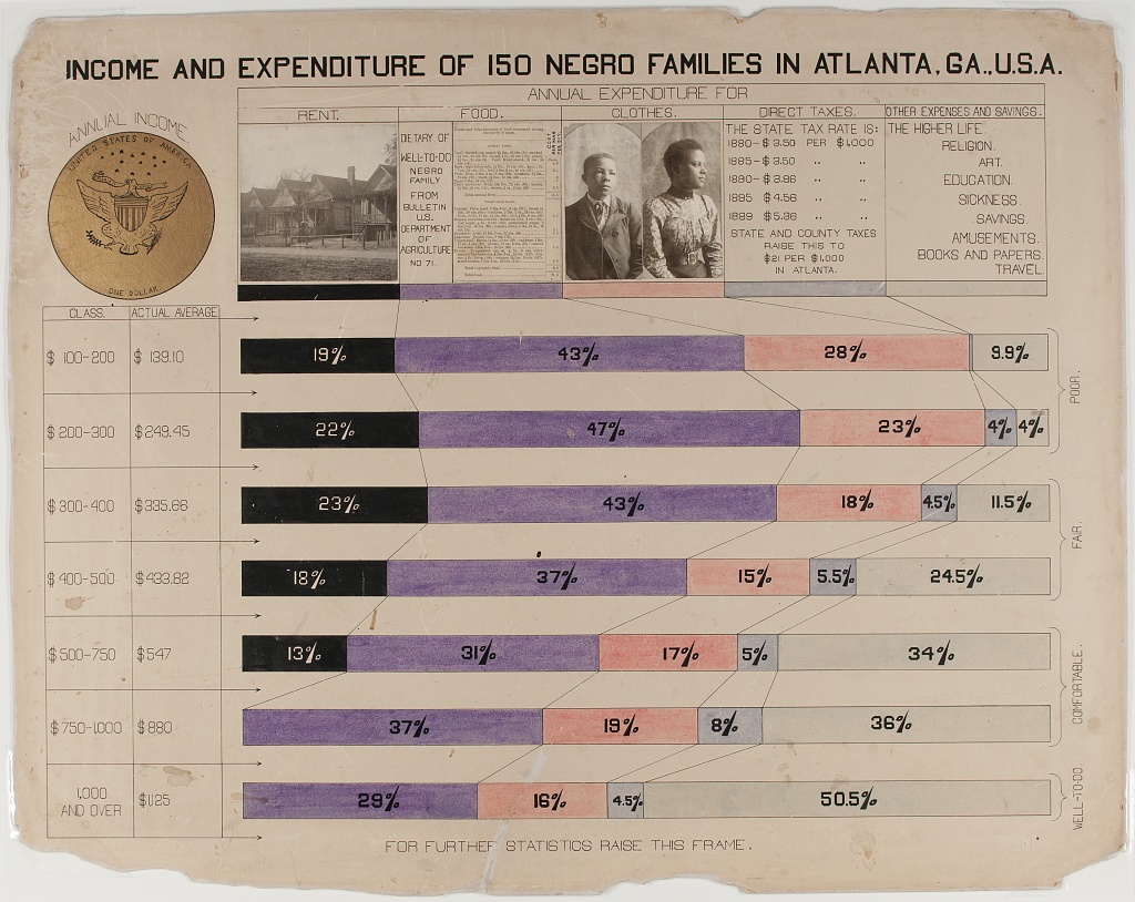
Week 10: Income and Expenditure (Apr 7)
Concluding with the household economics visualization demonstrated Du Bois’s understanding of how spending patterns varied by income level. This detailed breakdown required careful attention to color coding and proportional representation. I only focussed on the chart sections.

I put together all weeks in this gallery on Tableau Public
Lessons Learned
This year’s challenge reinforced several key insights about data visualization:
- Historical Context Matters: Du Bois’s visualizations weren’t just technically innovative, they told a powerful story about Black economic progress during Reconstruction that challenged prevailing narratives.
- Creative Constraints Breed Innovation: The limitations of 1900s graphic design tools didn’t restrict Du Bois; they pushed him to create entirely new forms of visualization. Similarly, working within Tableau’s capabilities forced me to think more creatively.
- Visual Metaphors Connect: Du Bois’s use of visual metaphors (money bags, spirals, etc.) made complex economic data immediately accessible. This remains a powerful technique in modern data visualization.
- Beauty and Accuracy Coexist: Du Bois proved that visualizations could be both aesthetically striking and rigorously accurate. This balance remains the holy grail of data visualization.
- Visualization is Activism: Perhaps most importantly, Du Bois showed how data visualization can be a form of activism, making compelling arguments through visual representation that might otherwise be dismissed in textual form.
Looking Forward
Completing the 2025 Du Bois Challenge has deeply influenced how I approach data visualization. By embracing creative interpretation rather than strict replication, I’ve gained a deeper appreciation for the principles that made Du Bois’s work revolutionary. His visualizations weren’t just about showing data, they were about changing minds and challenging assumptions through innovative visual communication.
As we continue to navigate our own era of data abundance and misinformation, Du Bois’s example reminds us that how we present data matters as much as the data itself. I invite you to explore my complete gallery of visualizations from this challenge on Tableau Public and consider how these century-old visualization techniques might inspire your own data storytelling.

Leave a comment