
I have been a big fan for Football (soccer for some of you) for a very long time, but this is my very first Tableau Football World Cup. This is also the first time I create dashboards with Tableau and my team France wins **, so it must be a sign! I live in Australia and also support Australia, but let’s not go there..
I decided to take on the challenge and create Tableau visualisations based on live results from the 2018 FIFA Football World Cup.
So, why doing all of this Tableau dashboard stuff?
- I love data and I love Football
- I love story telling with Tableau (learning!)
- I love practising my Tableau skills (on my training wheels)
- I’m French/Australian so I had an extra motivation. As the tournament progressed and France improved and went further, I wanted to explore more and more.
So where did it start?
I had only recently started the #SportsVizSunday challenge and got quite inspired doing the FIFA World cup data challenge, see below.
Live link: goo.gl/95q5n1
Process
Data: I had been thinking about data for a while and had started creating a skeleton data file on Excel. I could not find anything online to connect to, so I figured it might be easier to build the dataset from scratch.
It turned out more challenging than originally planned. I didn’t have the full picture, the full data and reporting requirements, so I found myself tweaking the file constantly, almost until the end. For example I hadn’t planned penalty shoot out scores!
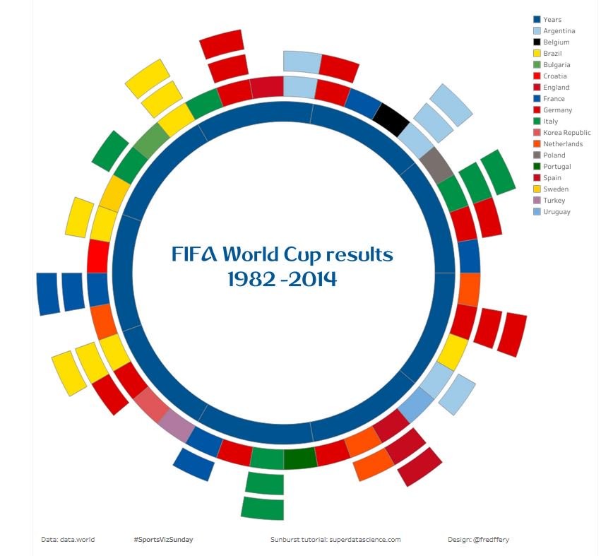
#1: First dashboard, setting the scene
My first Tableau dashboard was quite simple and broad. It was designed as a score card and I didn’t have any plans to go beyond this, BUT…I got into the #AnalyzeTheGame…
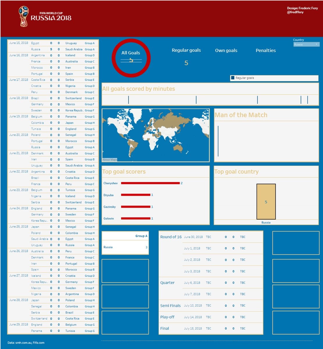
Vis: http://bit.ly/WC2018russia
Then, data started to talk…as I was digging in the data, more ideas came.
#2: Germany bad performance
Data allowed me to notice that Germany had shot 67 times at goals but could only manage to score 2 goals – Germany was out!
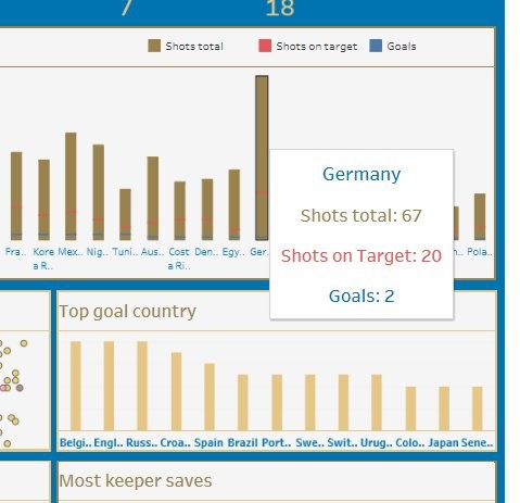
Live link: https://tabsoft.co/2l8MafC
#3: No African nation no knockout stages
Surprise in data: no African nation has reached the knockout stages but interestingly they scored more goals than other confederations ie Asia and Central, North America, just bad luck?
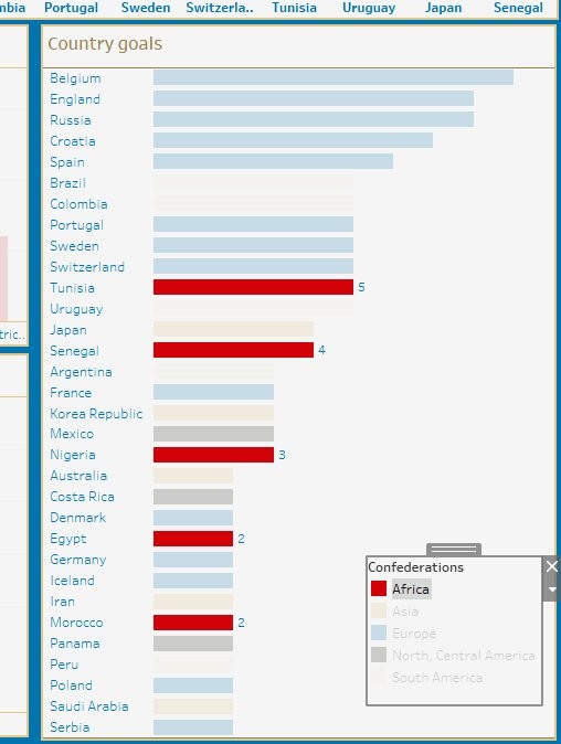
Live link: tabsoft.co/2l8MafC
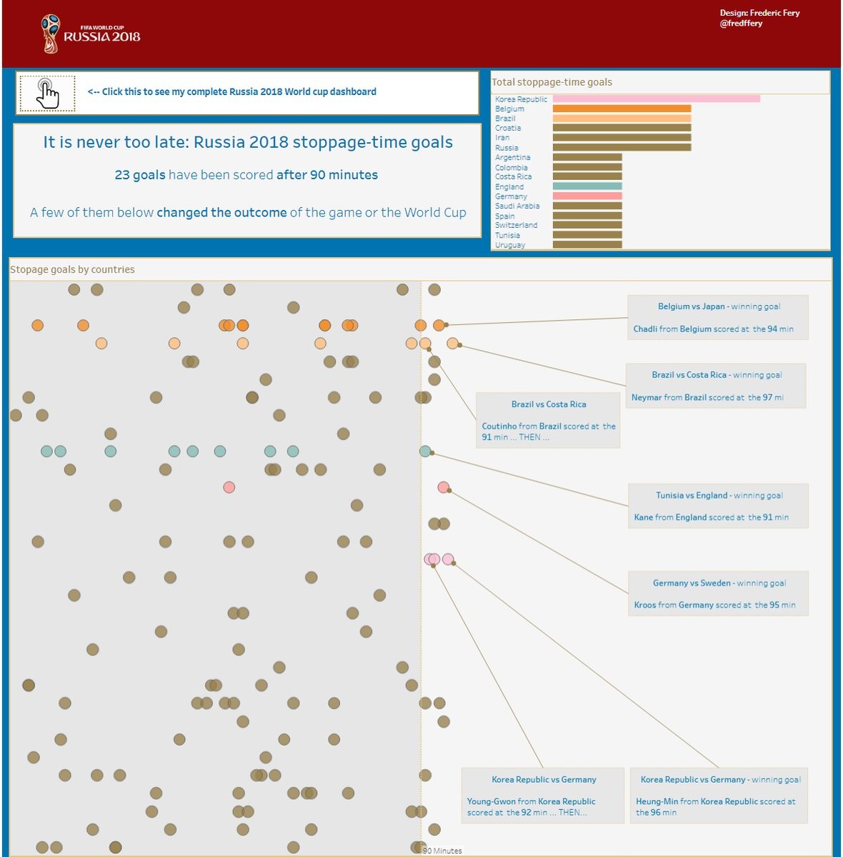
#4: Stoppage-time goals that had an impact
Many goals have been scored after 90 minutes (26 in total I think). A few of them below changed the outcome of the game or the World Cup.
Live link: http://bit.ly/WCstoppagegoals
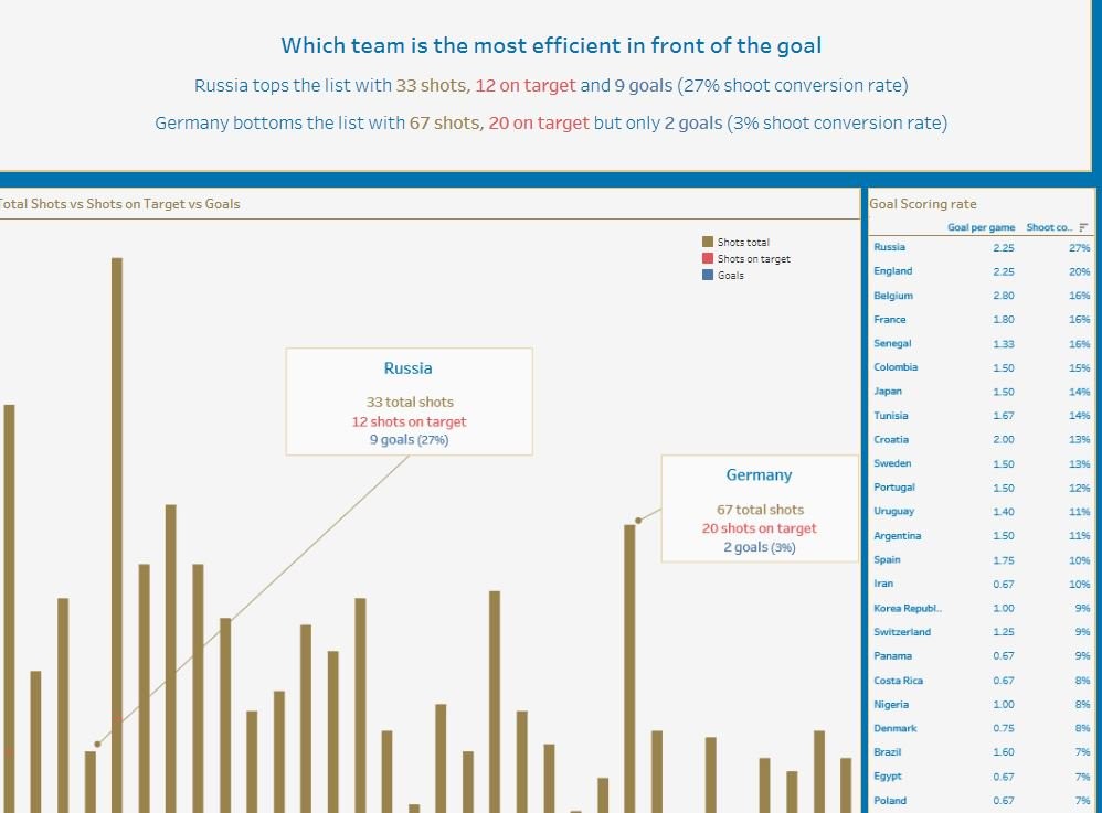
#5: Which team is the most efficient in front of the goal?
Again data talked, Russia tops the list 33 shots 27% conversion rate – Germany bottoms the list 67 shots but only 3% conversion rate. it explains Germany’s down fall.
Live link: https://tabsoft.co/2lXNgvd
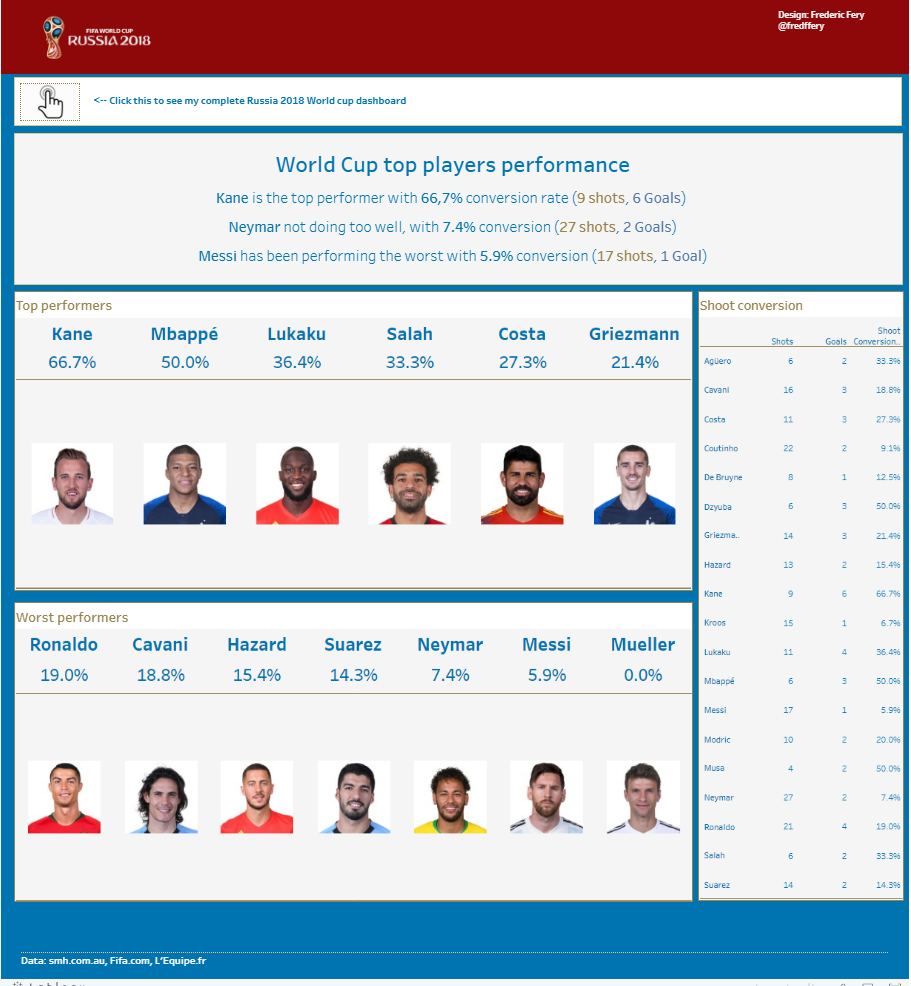
#6: Top players individual performance
This dashboard focused on top players performance. Data enables us to see that Kane was the top performer and Neymar and Messi didn’t do well at all. Messi is the worst of performers (17 shots and 1 goal only) amongst big stars.
Live link: http://bit.ly/WCtopplayers
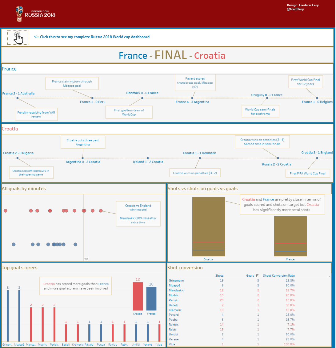
#7: France vs Croatia Final – How did they get there?
Final! With this dashboard, I have compared the 2 teams performance, shots, goals, top strikers..
Live link: bit.ly/WCfinalists
#8: France, we are the winners – the two stars
This last one, kind of obvious…how did France get there?. Who from French team performed?
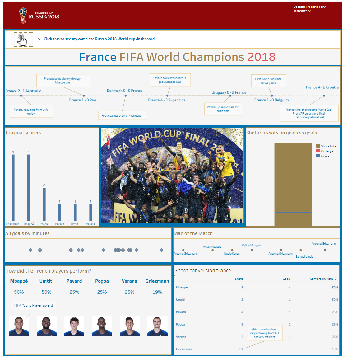
Live link: http://bit.ly/WCFrance
Refer to my Tableau public dashboards for all Tableau related work.
Long live #AnalyzeTheGame

Hello, iam practicing, i wonder if you can send me the dataset of this dataviz in order to play with it, thanks in advance
LikeLike
sure, I’ll send you something
LikeLike