
Thanks again to the #makeovermonday community I got inspired by Ken Flerlage work on his 2017 Year of learning post, and more specifically this work on Tableau geometric art.
Ken is truly inspirational. I have never seen this done in Tableau before!
#Fridayfun, I decided to have a go following the great tutorial from his site and went for the simple bubble method.
Method 1: Simple Bubbles
1) Generate your Excel file and create your custom color palette using the steps detailed above, then connect to the file in Tableau.
2) Drag the Shapes sheet to the data pane.
3) Convert Circle # to a dimension.
4) Drag Circle # to the Color card, then choose your new custom color palette.
5) Change the color transparency to 50%.
6) Change the sorting of Circle # to descending (These images are created by layering shapes on top of each other, so the descending sort will ensure the proper layering).
7) Create a calculated field called Circle Area with the formula “PI()*SQUARE([_R])”.
8) Drag Circle Area to the Size card.
9) Drag _Cx to the Rows shelf and _Cy to the Columns shelf.
10) Reverse the y axis.
11) Change the shape to a filled circle.
12) Play with the sizing of your shapes until the image looks right.
13) Make other adjustments as desired including gridlines, fixed axes, etc.
This was quite challenging but fun. Ken was my live Twitter support and gave me great guidance.
I used my daughter’s Anna charcoal drawing of Truganini, a famous aboriginal women from Tasmania, the last surviving full blooded Tasmanian Aboriginal.
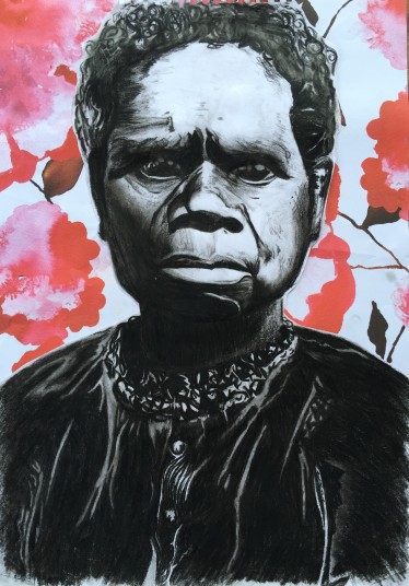
and after a bit (a lot) of trial and error I turned it into a simple Tableau artwork.
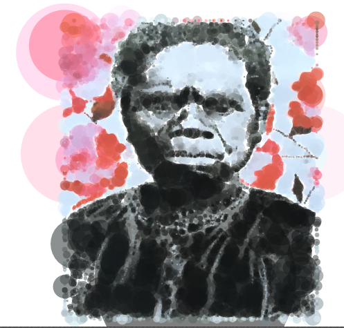
Vis: goo.gl/L3ydgv
I’m not sure if it is really relevant for my work, but sure it is for learning about Tableau

How did you get the color palette to work? I tried but I couldn’t work it out
LikeLike
did you check how to create the custom palette from his instructions
https://www.flerlagetwins.com/2017/12/geometric-art-in-tableau_17.html
If you are really stuck you could chat to Ken and ask him. It has been a while since I tried this
LikeLike